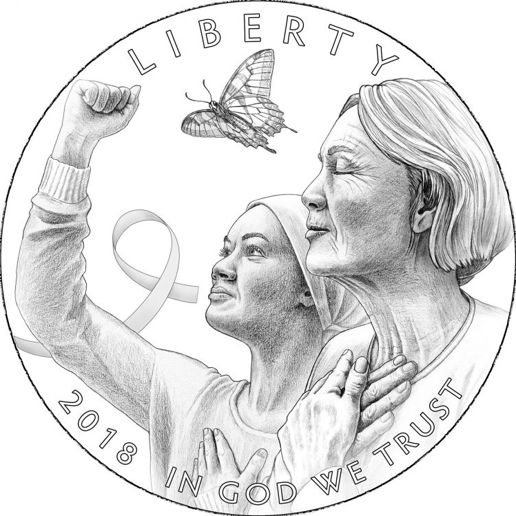
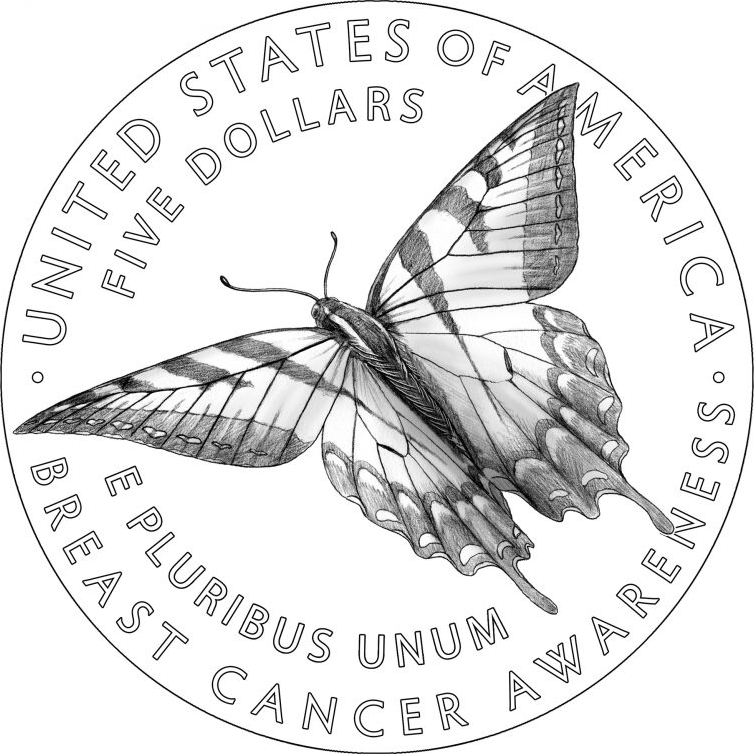
I’m excited to share that, on March 15, the U.S. Mint will release a new commemorative coin that I designed. The theme of the coin is Breast Cancer Awareness, and surcharges will go to the Breast Cancer Research Foundation. The design for this coin was selected through a national competition, open to all U.S. residents and citizens. There will be a clad, a silver, and a gold coin available, all with the same obverse and reverse design but different denominations. In a first for the Mint, the latter will be pink gold.
As I began considering ideas for this coin design, I quickly realized that – to me – a design about breast cancer awareness should focus on the people affected by it rather than an impersonal image of the cancer itself or the body parts involved. I thought it important for the design to convey some of the emotions people feel when faced with the cancer, whether they are patients, survivors, or the friends and family members of breast cancer patients and survivors. It followed, then, that I would need to show faces in order to convey emotions, and it made sense for the faces to go on the obverse (heads) side of the coin.
One of my cousins had breast cancer and I found myself trying to imagine how she and her immediate family members must have felt when going through the stages of diagnosis, treatment, and being told she was cancer-free. Many emotions came to mind, but those that stood out to me as especially important were determination, hope, and a sense of relief. I thought about how a person might show these emotions in an obvious way, and then I asked my sister and my niece to pose for me, so I could take some reference photographs. They were superb models, able to display these emotions more poignantly than I could have directed. I drew the women on the obverse with the aid of my reference photos, making sure to change the facial features considerably so that they are not representations of any living person.

Design for the obverse side of the Breast Cancer Awareness Commemorative coin © United States Mint; Used with permission.
Conceiving ideas for the reverse side of the coin was more difficult. I eventually landed on the concept of showing a butterfly because butterflies are symbols of hope. Including one on the obverse as well as the reverse would help unify the designs. On both sides, I show a butterfly in flight because I felt that pose would best convey the symbolism. I was careful to show the insect in a life position rather than as a dead, pinned specimen. (For more about representations of dead butterflies in popular culture, read my earlier blog post.)

Design for the reverse side of the gold Breast Cancer Awareness Commemorative coin © United States Mint; Used with permission.
I wanted to select a butterfly species that might be recognizable to many people and one that’s native to the United States. Monarchs are lovely and are certainly the most familiar of North American species, but their much-publicized and unfortunate decline in recent years means they have their own baggage and might not be the best symbol of hope. I chose instead to draw a Tiger Swallowtail. There are two species of Tiger Swallowtail that are nearly identical; the Eastern (Papilio glaucus) and the Western (Papilio rutulus). My illustration could be either one. Together, those two species range over most of the continental USA. Their distribution, combined with their large size and distinctive markings, make them recognizable to many.
It occurred to me as I was composing this blog post that there have probably been very few invertebrates represented on United States coins. A quick perusal of Q. David Bowers’ A Guide Book of United States Commemorative Coins (2nd ed.) yielded one: the 1935 Hudson Sesquicentennial Half Dollar reverse includes a conch shell, a tiny and barely identifiable design element but an invertebrate nonetheless. I also reviewed the US State quarters and America the Beautiful quarters to date, and didn’t find any invertebrates among them. My search was certainly not comprehensive, so I invite readers to bring to my attention any other US coins that show invertebrates. As one who celebrates the under-appreciated invertebrates, I am proud to be responsible for putting one on a US coin, even though that wasn’t my goal when I created the design.